
The Chinese Dragon has Landed
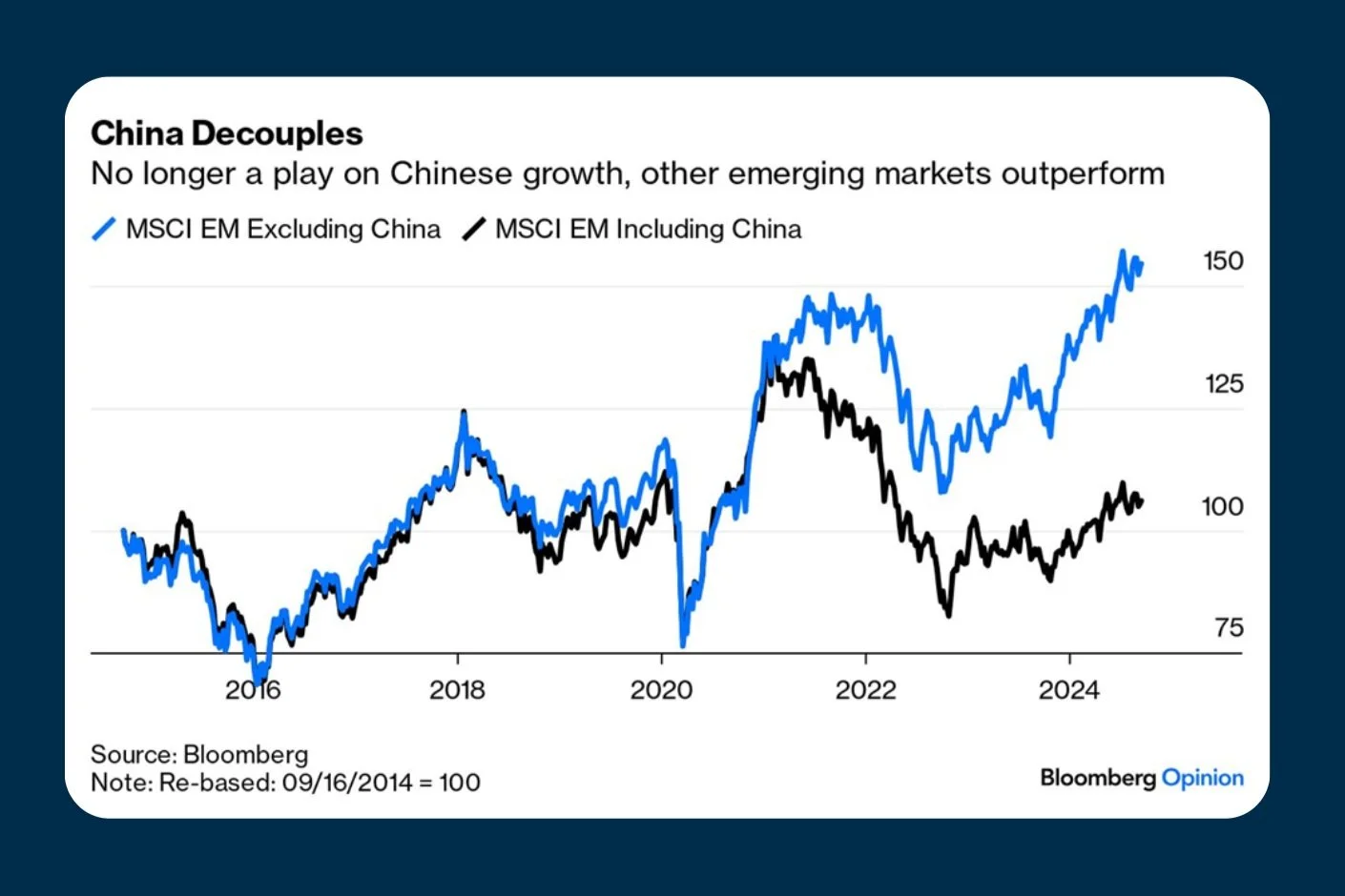
The black line represents the Emerging Market Index, which includes a 27% exposure to China. The blue line is the same index but with China removed. For most of history, they have tracked each other almost identically. Then COVID hit. In hindsight, China’s response was catastrophic. The ‘Zero-COVID’ policy was devastating for the economy. While the rest of the world gradually returned to normal, China did not—and its economy floundered. Since then, the historically strong correlation between the two lines has broken down, and it is now at its widest point since the Emerging Market Index was created.
If you believe the Chinese economy will never recover, the chart affirms your view. If you believe a recovery is coming, then the chart signals a monumental investment opportunity in a mispriced asset.